UI Systems That Stay Consistent as Products Grow
How we build UI foundations — components, spacing, and interaction patterns — so new screens feel like the same product, not a patchwork.

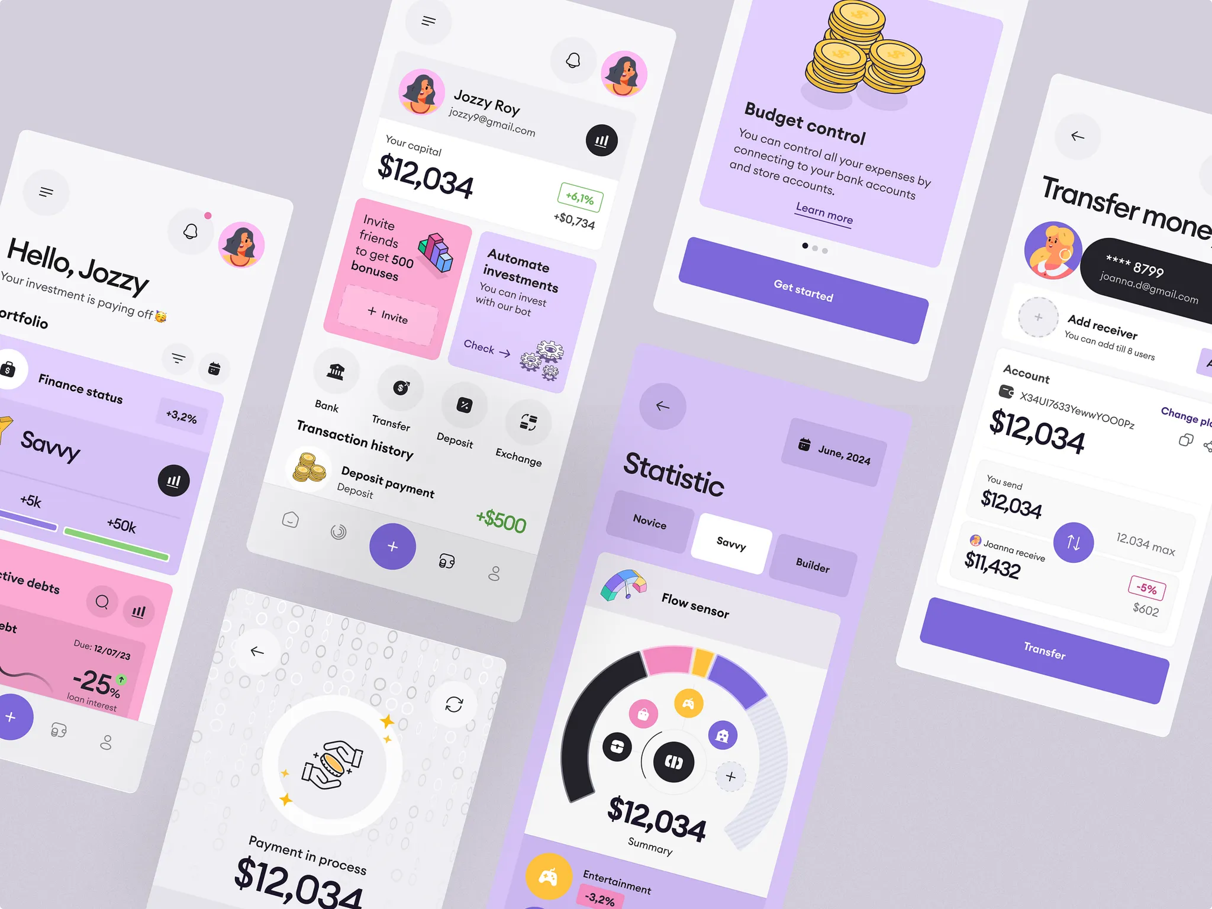
A product doesn’t feel premium because one screen is beautiful. It feels premium when the tenth screen still matches the first. That only happens when design and engineering share a system — not a folder of one-off mockups.
Tokens before decoration
Color, type, spacing, and radius should be named decisions, not copy-pasted hex values. When tokens live in code, a brand refresh or dark-surface tweak doesn’t require hunting every component by hand.
Components with intent
Buttons, inputs, and cards need clear variants and states — default, hover, focus, disabled, error — or engineers invent their own. Document when to use each variant in plain language so the system teaches taste, not just structure.
- Shared tokens for color, type, space, and elevation
- Components that cover loading and error states, not only happy paths
- Patterns for forms, tables, and empty states reused across features
- A review loop so new UI either joins the system or challenges it deliberately
“Consistency is a product feature. Users feel it even when they can’t name it.”
Motion with purpose
Use motion to show hierarchy and feedback — not decoration. A short transition that confirms an action builds trust; random bounce drains it. Ship two or three intentional motions and reuse them everywhere.
Keep reading
Design Systems for AI Products: Components That Expect Uncertainty
How to extend a design system for AI surfaces — streaming states, partial answers, citations, confidence, and recovery — so copilots and agents feel intentional instead of bolted on.
ReadUI & UXUX That Survives Real Users: Designing Flows, Not Screens
Pretty screens fail when the job is unclear. How we map journeys, reduce decision load, and design product UX that holds up under real use.
ReadUI & UXDesigning Interfaces for Uncertainty: UX Patterns for Modern Products
When products include automation or AI, the same action won’t always produce the same result. UX patterns for trust, control, and graceful recovery.
Read