UX That Survives Real Users: Designing Flows, Not Screens
Pretty screens fail when the job is unclear. How we map journeys, reduce decision load, and design product UX that holds up under real use.

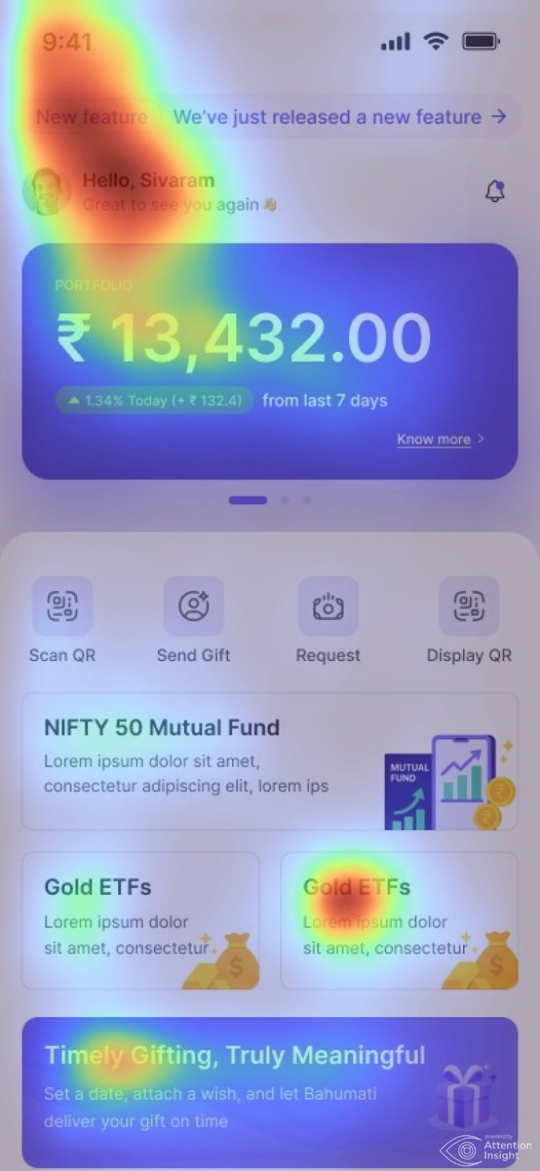
Most failed product UX doesn’t fail because the colors were wrong. It fails because the user never knew what to do next. Screens look finished in Figma; flows look finished only when someone can complete a job without asking for help.
Start with the job, not the layout
Before wireframes, write the job in one sentence: book an appointment, approve an invoice, qualify a lead. If the team can’t agree on that sentence, the UI will paper over disagreement with extra buttons and dead ends.
Map decisions, not pages
A good flow inventory lists every decision the user must make, every piece of information they need, and every place they can get stuck. That map is more valuable than a polished mock for an empty state you haven’t designed yet.
- One primary action per screen whenever possible
- Progress and confirmation that match how people think about the task
- Empty, loading, and error states designed as first-class UX
- Copy that names the outcome, not the feature
Validate with reality
Prototype the critical path and watch someone try it. You’ll learn more in thirty minutes of observation than in a week of opinion. Then harden the unhappy path — wrong inputs, missing data, interrupted sessions — so the product still feels trustworthy when life gets messy.
“Users don’t remember your layout. They remember whether the product helped them finish.”
Keep reading
Design Systems for AI Products: Components That Expect Uncertainty
How to extend a design system for AI surfaces — streaming states, partial answers, citations, confidence, and recovery — so copilots and agents feel intentional instead of bolted on.
ReadUI & UXUI Systems That Stay Consistent as Products Grow
How we build UI foundations — components, spacing, and interaction patterns — so new screens feel like the same product, not a patchwork.
ReadUI & UXDesigning Interfaces for Uncertainty: UX Patterns for Modern Products
When products include automation or AI, the same action won’t always produce the same result. UX patterns for trust, control, and graceful recovery.
Read